# Foundations
Alex Cardazzi
All materials can be found at
alexcardazzi.github.io.
## Plotting
An especially attractive feature of R (that does not differ between `.R`
and `.qmd`) is its powerful graphics. Just Google “[Best R
Plots](https://share.google/d10PMCjNhreQWoN7K)”, and you’ll see what I
mean.
To start, we’ll learn some of the basics. We will begin by generating
two scatter plots using data from `ford`.
1. Plot `mileage` vs `Price`.
2. Plot `mileage` vs `cost_per_mile`.
Code
``` r
ford <- read.csv("https://alexcardazzi.github.io/econ311/data/ford_escort.csv")
colnames(ford)[2] <- "mileage" # change the second name
ford$mileage <- ford$mileage * 1000 # Multiply by 1000 and save/overwrite
ford$cost_per_mile <- ford$Price / ford$mileage # Create $/mi
plot(ford$mileage, ford$Price)
# This is the same as:
# plot(x = ford$mileage, y = ford$Price)
```
Plot

Below contains some examples of additional arguments for the `plot()`
function.
1. `las = 1` rotates the text on the y-axis. Different numbers will
rotate it more or less
2. `col` sets the colors used in the plot. This can take a vector of
colors.
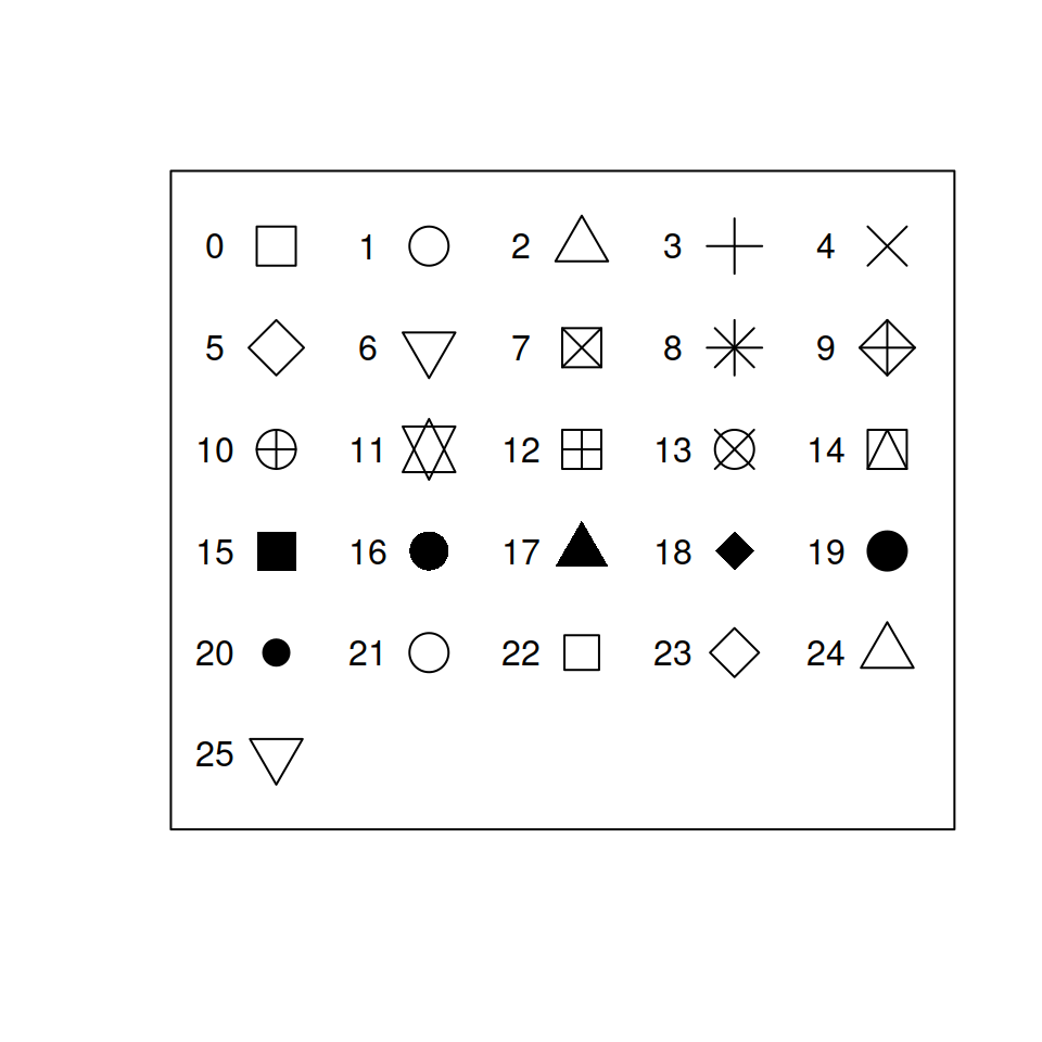
3. `pch` sets the type of point used.
4. `cex` sets the size of the points. The default is 1.
5. `main` sets the title of the plot.
6. `xlab` sets the name of the x-axis
7. `ylab` sets the name of the y-axis
Code
``` r
plot(ford$mileage, ford$cost_per_mile, las = 1,
pch = 23, cex = 1.2,
col = "tomato", main = "Cost vs Mileage",
xlab = "Mileage", ylab = "Price per Mile")
```
Plot

Try tweaking some of these options in the following WebR chunk:
``` r
ford <- read.csv("https://alexcardazzi.github.io/econ311/data/ford_escort.csv")
colnames(ford)[2] <- "mileage" # change the second name
ford$mileage <- ford$mileage * 1000 # Multiply by 1000 and save
ford$cost_per_mile <- ford$Price / ford$mileage # Create $/mi
plot(ford$mileage, ford$cost_per_mile, las = 1,
pch = 23, cex = 1.2,
col = "tomato", main = "Cost vs Mileage",
xlab = "Mileage", ylab = "Price per Mile")
```
We can also add reference lines to the plot, and also make the colors a
bit more complex.
``` r
# Set all colors as "tomato"
ford$point_color <- "tomato"
# If the Year is less than the mean year, color it "dodgerblue"
# Of course, these are therefore the "older" cars
ford$point_color[ford$Year < mean(ford$Year)] <- "dodgerblue"
plot(ford$mileage, ford$cost_per_mile, las = 1,
pch = 19, cex = 1.2,
col = ford$point_color, main = "Cost vs Mileage",
xlab = "Mileage", ylab = "Price per Mile")
abline(h = 1) # horiz. line at Y = 1
abline(v = mean(ford$mileage)) # vert. line at the mean of X
```
Plot

Of course, whenever you choose to add some differences in shapes,
colors, etc., it’s helpful to add a legend to your plot. To do this, we
can use the `legend()` function. This function accepts a few important
arguments:
- `bty`: setting this to `"n"` removes the box around the legend. I
*always* use this option.
- `legend`: this is the actual text to be displayed in the legend. It
accepts a character vector, so if you colored your plot by men and
women, you would use `c("Men", "Women")`.
- `x`, `y`: You can specify the exact coordinates of your legend, or you
can specify things like: `"topleft"`, `"topright"`, `"bottomleft"`, or
`"bottomright"`.
- `horiz`: this accepts a boolean value, and turns the legend from
vertical to horizontal.
- Then, you will need to specify either `pch` or `lty` options to tell R
if you want to display points or lines next to your legend.
Below is a plot with two legends (which is certainly redundant) to show
off some of the different ways to customize the output.
``` r
plot(ford$mileage, ford$cost_per_mile, las = 1,
pch = 19, cex = 1.2,
col = ford$point_color, main = "Cost vs Mileage",
xlab = "Mileage", ylab = "Price per Mile")
legend("topright", pch = 19, bty = "n", horiz = TRUE,
legend = c("Old Ford", "New Ford"), cex = 1.5,
col = c("dodgerblue", "tomato"))
legend("bottomleft", lty = c(1, 2), pch = c(2, 19),
legend = c("Old Ford", "New Ford"),
col = c("dodgerblue", "tomato"))
```
Plot

When generating figures, you will sometimes need to add data from a
different source to the same set of axes. As an example, let’s simply
plot the data above, but in two steps instead of one.
To do this, we will use `points()`. This function accepts nearly every
argument `plot()` does, except you are unable to impact the axes/labels
of the plot.
``` r
plot(ford$mileage[ford$point_color == "tomato"],
ford$cost_per_mile[ford$point_color == "tomato"],
las = 1, pch = 19, cex = 1.2,
col = "tomato", main = "Cost vs Mileage",
xlab = "Mileage", ylab = "Price per Mile")
points(ford$mileage[ford$point_color != "tomato"],
ford$cost_per_mile[ford$point_color != "tomato"],
pch = 19, cex = 1.2, col = "dodgerblue")
```
Plot

Notice how I am subsetting the data when plotting. This is an important
thing to learn!
Once you get the hang of using `plot()` and `points()` in tandem, you’ll
find it convenient that `points()` does not impact the axes. However, to
start, this will be annoying. For example, let’s switch the order of the
data in `plot()` and `points()`.
``` r
plot(ford$mileage[ford$point_color != "tomato"],
ford$cost_per_mile[ford$point_color != "tomato"],
las = 1, pch = 19, cex = 1.2,
col = "dodgerblue", main = "Cost vs Mileage",
xlab = "Mileage", ylab = "Price per Mile")
points(ford$mileage[ford$point_color == "tomato"],
ford$cost_per_mile[ford$point_color == "tomato"],
pch = 19, cex = 1.2, col = "tomato")
```
Plot

The plot is different because when `plot()` is setting the axes, it
doesn’t know that you’re planning on using `points()` next. So, it
scales the axes so the data fed into `plot()` “fits” the space.
To overcome this issue, we can use the following trick. The idea is to
plot the point (0, 0) (or any point, really!), but use `type = "n"` so
the point is not displayed. Then, within this `plot()` call, we can set
`ylim` and `xlim` equal to `range()` of the variables we’ll plot so axes
fit the data perfectly.
Code
``` r
plot(0, 0, type = "n",
ylim = range(ford$cost_per_mile),
xlim = range(ford$mileage), # range can include multiple vectors
main = "Cost vs Mileage", las = 1,
xlab = "Mileage", ylab = "Price per Mile")
points(ford$mileage[ford$point_color != "tomato"],
ford$cost_per_mile[ford$point_color != "tomato"],
pch = 19, cex = 1.2, col = "dodgerblue")
points(ford$mileage[ford$point_color == "tomato"],
ford$cost_per_mile[ford$point_color == "tomato"],
pch = 19, cex = 1.2, col = "tomato")
```
Plot

Of course, this is a *lot* more coding than the initial plot’s code. The
idea of showing you this is that, now, you can always make sure your
data “fits”. This is one of the little things that I use constantly, but
it took me a long time to figure out.
Finally, adding lines to a plot is very similar in that one needs to use
`lines()`. To illustrate, we will examine [panel data on cigarette
consumption by
state](https://vincentarelbundock.github.io/Rdatasets/csv/Ecdat/Cigar.csv)
([documentation](https://vincentarelbundock.github.io/Rdatasets/doc/Ecdat/Cigar.html)).
Read in the data, and plot sales on the y-axis and year on the x-axis
below. Be sure to clean the data where appropriate.
``` r
# read data
cig <- read.csv()
# Maybe take a peak at the data:
# head(cig)
# clean data
# plot data
```
Solution
``` r
cig <- read.csv("https://vincentarelbundock.github.io/Rdatasets/csv/Ecdat/Cigar.csv")
cig$year <- cig$year + 1900
plot(cig$year, cig$sales, las = 1,
ylab = "Sales", xlab = "Year")
```
Plot

This figure is very difficult to understand. Let’s trim it down to just
a few states. In addition, we can add colors to the figure.
Unfortunately, the states seem to just be numbered instead of labeled,
so we’ll just pick 1 through 5. In addition, there does not seem to be a
state number 2.
``` r
cig <- cig[cig$state %in% 1:5,]
plot(cig$year, cig$sales, las = 1,
# since state is a number,
# we can just use this as the color
col = cig$state,
ylab = "Sales", xlab = "Year")
```
Plot

This plot can still be improved. It’d be a lot more natural to see the
data as lines instead of points. To do this, we can use `type = "l"`.
``` r
plot(cig$year, cig$sales, las = 1,
col = cig$state, type = "l",
ylab = "Sales", xlab = "Year")
```
Plot

Notice two things about this plot. First, there’s only a single color.
In R, you should think of a line as a single point. R cannot color
different parts of line differently, so it will just take the first
color it’s given (here, it’s 1, which is black). Second, there are these
three crazy diagonal lines that dash across the plot. This is because R
is trying to connect each line into a single one. If you look closely, R
is connecting the last year of one state to the first year of another
state.
To fix this, we need to use `lines` like we used `points` before. This
is another example case of a time where we’ll want to set up the axes
before we plot anything.
Code
``` r
# before, I plotted 0, 0
# now, I am simply keeping the data
# in plot().
# this way, I don't need to set the axes
# via ylim() and xlim()
plot(cig$year, cig$sales,
las = 1, type = "n",
ylab = "Sales", xlab = "Year")
lines(cig$year[cig$state == 1],
cig$sales[cig$state == 1],
col = 1)
lines(cig$year[cig$state == 3],
cig$sales[cig$state == 3],
col = 3)
lines(cig$year[cig$state == 4],
cig$sales[cig$state == 4],
col = 4)
lines(cig$year[cig$state == 5],
cig$sales[cig$state == 5],
col = 5)
legend("bottomleft", ncol = 2,
legend = c("State 1", "State 3", "State 4", "State 5"),
bty = "n", col = c(1, 3, 4, 5), lty = 1)
```
Plot

Next module, you’ll learn about “loops”, which will significantly cut
down on the amount of code we need to write to generate these lines.