Plots and Maps in R
Alexander Cardazzi
August, 2021
Simple Plots
To start, we will use the quakes data we used in a previous workshop. We are also going to load in a few packages. These will be scales, lubridate and sf. scales will allow us to make our plots opaque, which helps one see density, in a way. lubridate is for dates, which I have noted before, and sf is for spatial data. We will use this later on.
library("scales")
library("lubridate")
library("sf")

rm(list = ls())

data("quakes")
Once everything is loaded (do not forget to install.packages), let's make a really simple, bare-bones plot.
plot(quakes$mag, quakes$stations)
This is a fairly straightforward, x-y scatterplot. If we want to make this much nicer, there are a ton of options we can use. Some of the arguments plot accepts:
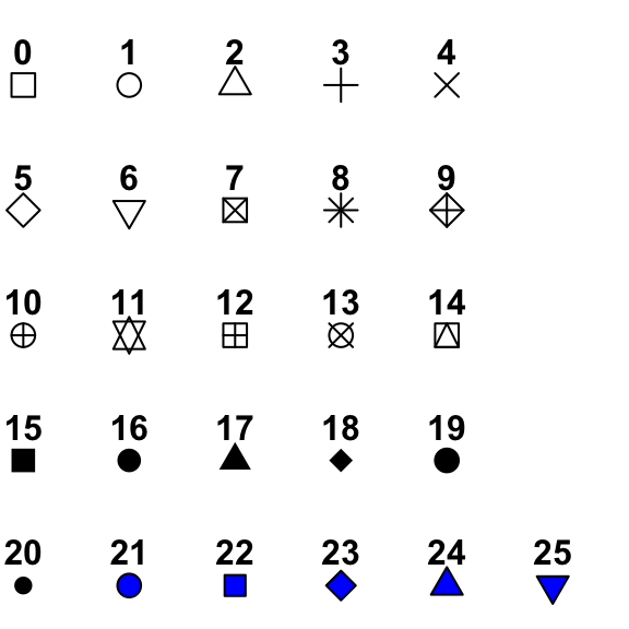
xlab,ylab,main: these allow you to label your plotxlim,ylim: these allow you to scale your plot (default will fit the data, though)col: colors ... this is where we will use thescalespackage.type: this can be left out for points as default, but accepts "p" (points), "l" (lines), "b" (both), or "h" (histogram)pch: point type. link.lty: line type. link.cex: point size (default = 1)lwd: line width (default = 1)bty: border type (no border = "n", otherwise do not touch)?plotfor more!
In addition, there are other functions you can use to add to an already existing plot:
points: add points to a plot - use similar toplot, but axes and labels are already set.lines: add lines to a plot - use similar toplot, but axes and labels are already set.segments: add segments to a plot - this takes x0, x1, y0, and y1 instead of just x, ypolygon: this takes x and y, but the data much be in order. See example below - you will likely need rev()abline: add straight lines to a plot (h = horizontal, v = vertical or a/b = int/slope)legend: add legend to plot
Some examples of how to use these are below:
Example 1 - Scatterplot With Lines
plot(quakes$mag, quakes$stations,
     xlab = "Magnitude",
     ylab = "Stations",
     main = "Magnitude vs Stations",
     pch = 20,
     type = "p",
     col = alpha("dodgerblue", .2),
     xlim = c(3.5, 7),
     ylim = c(0, 140))

abline(v = 4)
abline(h = 0, lty = 2, col = "gold")
abline(0, 1, col = "red")
abline(lm(stations ~ mag, data = quakes), col = "mediumseagreen")
Example 2 - Aggregate Plot, Adding Points
agg <- aggregate(list(stations = quakes$stations), by = list(mag = quakes$mag), FUN = mean)

plot(agg$mag, agg$stations)
abline(lm(stations ~ mag, data = quakes))
reg <- lm(stations ~ mag + I(mag^2) + I(mag^3), data = quakes)
agg2 <- aggregate(reg$fitted.values, list(mag = quakes$mag), mean)
points(agg2$mag, agg2$x, col = alpha("red", .3), pch = 19)
Example 3 - Confidence Intervals
agg_sd <- aggregate(list(stations = quakes$stations), by = list(mag = quakes$mag), FUN = sd)
agg_n <- aggregate(list(stations = quakes$stations), by = list(mag = quakes$mag), FUN = length)

lim <- agg_n$mag <= 5.5 #using this limit since low N for some of the larger magnitudes

plot(agg$mag[lim], agg$stations[lim])
segments(x0 = agg$mag[lim], x1 = agg$mag[lim],
         y0 = agg$stations[lim] - (1.96*agg_sd$stations[lim]/sqrt(agg_n$stations[lim])),
         y1 = agg$stations[lim] + (1.96*agg_sd$stations[lim]/sqrt(agg_n$stations[lim])))
Notice how the CI is cutoff at the top and bottom. This is a time where we need to adjust the ylim:
plot(agg$mag[lim], agg$stations[lim],
     ylim = c(min(agg$stations[lim] - (1.96*agg_sd$stations[lim]/sqrt(agg_n$stations[lim]))),
              max(agg$stations[lim] + (1.96*agg_sd$stations[lim]/sqrt(agg_n$stations[lim])))))
segments(x0 = agg$mag[lim], x1 = agg$mag[lim],
         y0 = agg$stations[lim] - (1.96*agg_sd$stations[lim]/sqrt(agg_n$stations[lim])),
         y1 = agg$stations[lim] + (1.96*agg_sd$stations[lim]/sqrt(agg_n$stations[lim])))
Example 4 - Polygons
Notice how I have to use the rev() function to make this work. You can test what it would look like without it.
plot(agg$mag[lim], agg$stations[lim],
     ylim = c(min(agg$stations[lim] - (1.96*agg_sd$stations[lim]/sqrt(agg_n$stations[lim]))),
              max(agg$stations[lim] + (1.96*agg_sd$stations[lim]/sqrt(agg_n$stations[lim])))))
polygon(x = c(agg$mag[lim],
              rev(agg$mag[lim])), #rev here
        y = c(agg$stations[lim] - (1.96*agg_sd$stations[lim]/sqrt(agg_n$stations[lim])),
              rev(agg$stations[lim] + (1.96*agg_sd$stations[lim]/sqrt(agg_n$stations[lim]))))) #rev here
We have the basics down, but this looks awful. If we keep toying with it ...
plot(agg$mag[lim], agg$stations[lim],
     ylim = c(min(agg$stations[lim] - (1.96*agg_sd$stations[lim]/sqrt(agg_n$stations[lim]))),
              max(agg$stations[lim] + (1.96*agg_sd$stations[lim]/sqrt(agg_n$stations[lim])))))
polygon(x = c(agg$mag[lim],
              rev(agg$mag[lim])),
        y = c(agg$stations[lim] - (1.96*agg_sd$stations[lim]/sqrt(agg_n$stations[lim])),
              rev(agg$stations[lim] + (1.96*agg_sd$stations[lim]/sqrt(agg_n$stations[lim])))),
        border = NA, col = alpha("blue", .33))
Finally, I plot the actual data after the polygon, so it can sit ontop.
plot(agg$mag[lim], agg$stations[lim],
     ylim = c(min(agg$stations[lim] - (1.96*agg_sd$stations[lim]/sqrt(agg_n$stations[lim]))),
              max(agg$stations[lim] + (1.96*agg_sd$stations[lim]/sqrt(agg_n$stations[lim])))),
     type = "n")
polygon(x = c(agg$mag[lim],
              rev(agg$mag[lim])),
        y = c(agg$stations[lim] - (1.96*agg_sd$stations[lim]/sqrt(agg_n$stations[lim])),
              rev(agg$stations[lim] + (1.96*agg_sd$stations[lim]/sqrt(agg_n$stations[lim])))),
        border = NA, col = alpha("blue", .33))
points(agg$mag[lim], agg$stations[lim], col = "tomato", pch = 19, lty = 2, type = "b")
Example 5 - Multiple Time Series
Let's simulate a panel dataset of 5 states and plot each time series.
set.seed(123)
data.frame(y = NA,
           time = rep(1:100, 5),
           state = c(rep("A", 100), rep("B", 100), rep("C", 100), rep("D", 100), rep("E", 100))) -> df
df$y <- rnorm(500, 0, 1) + ifelse((df$state == "A" & df$time > 15) | (df$state == "B" & df$time > 40) | (df$state == "C" & df$time > 60), 4, 0)

plot(df$time, df$y, col = match(df$state, LETTERS))
abline(v = c(15, 40, 60), lty = 2)
This is kind of like a diff-in-diff setting. It is hard to see the jumps in the outcome if they're just points. However, we cannot simply turn the plot into a line plot. See below:
plot(df$time, df$y, col = match(df$state, LETTERS), type = "l")
abline(v = c(15, 40, 60), lty = 2)
R gets confused on how to color the lines multiple colors and it tries to connect everything. Rather, we need to do this instead:
plot(df$time, df$y, type = "n")
abline(v = c(15, 40, 60), lty = 2)
for(i in unique(df$state)){

  lines(df$time[df$state == i], df$y[df$state == i],
        col = match(i, LETTERS))
}
Maps
To check out some of the mapping capabilities in R, we are going to use some data from NYC's portal. We are going to download a CSV and 3 GeoJSON files. The standard used to be .shp files, but .geojson is better. .shp files come with other files whereas .geojson is a single file. The data I picked was a map of the boroughs, the locations of each payphone, each subway entrance and areas that flooded during Huricane Sandy. Reading these files in is easy enough with the read_sf function.
nyc <- read_sf("https://data.cityofnewyork.us/api/geospatial/tqmj-j8zm?method=export&format=GeoJSON")
payphone <- read.csv("https://data.cityofnewyork.us/api/views/tvhc-4n5n/rows.csv?accessType=DOWNLOAD")
subway <- read_sf("https://data.cityofnewyork.us/api/geospatial/drex-xx56?method=export&format=GeoJSON")
sandy <- read_sf("https://data.cityofnewyork.us/api/geospatial/uyj8-7rv5?method=export&format=GeoJSON")
These payphones can be quite old in some cases. Let's plot a histogram of their install dates:
payphone$date <- mdy(payphone$INSTALLATION_DATE) #convert from the text to a date
plot(table(floor_date(payphone$date, "year")), #use floor_date to get the year.  Can also use the year() function.
     xlab = "Year", ylab = "Frequency")
Nice. Now let's get to some of this spatial stuff. First, let's have a look at the NYC object:
nyc## Simple feature collection with 5 features and 4 fields
## geometry type: MULTIPOLYGON
## dimension: XY
## bbox: xmin: -74.25559 ymin: 40.49612 xmax: -73.70001 ymax: 40.91553
## geographic CRS: WGS 84
## # A tibble: 5 x 5
## boro_code boro_name shape_area shape_leng geometry
## <chr> <chr> <chr> <chr> <MULTIPOLYGON [°]>
## 1 5 Staten Is~ 1623676768~ 326060.05~ (((-74.05051 40.56642, -74.05047 ~
## 2 2 Bronx 1187231178~ 464720.01~ (((-73.89681 40.79581, -73.89694 ~
## 3 3 Brooklyn 1934095186~ 729595.34~ (((-73.86706 40.58209, -73.86769 ~
## 4 4 Queens 3042317763~ 903938.44~ (((-73.82645 40.59053, -73.82642 ~
## 5 1 Manhattan 636605477.~ 359935.01~ (((-74.01093 40.68449, -74.01193 ~Notice how there is a CRS. This is important since we can project spatial data in many ways. Most of the time, people think of lat/long, but to do calculations, we need to 'flatten' the space we're working with. We will reproject this in a moment, but for now, let's just plot NYC. You can use plot as you normally would. The only caveat is if you are plotting another spatial object next, you cannot use points. You must use plot(..., add = TRUE). Below, I am just plotting regular lat/long as numeric values, so points will suffice.
OLD_MAR <- par()$mar
par(mar = rep(0, 4))
plot(nyc$geometry, border = NA, col = alpha(nyc$boro_code, .2))
legend("topleft",
       legend = nyc$boro_name, col = nyc$boro_code,
       pch = 15,
       bty = "n")
points(payphone$LONGITUDE, payphone$LATITUDE,
       col = alpha(ifelse(payphone$ACTIVE_INDIC == "Y", "mediumseagreen", "tomato"), .05), #if active, green, otherwise red
       pch = 20)
Next, let's think about converting regular data to spatial data.
payphone_sf <- st_as_sf(payphone, coords = c("LONGITUDE","LATITUDE")) #convert
st_crs(payphone_sf) <- st_crs(nyc) #make the CRS the same
To highlight how this works:
plot(nyc$geometry)
plot(payphone_sf$geometry, add = TRUE)
Cool. Now, what if you wanted to know which NYC borough each payphone belonged to? You could use st_join to merge the two datasets. This is like match() but for polygons and points! An example would be: st_join(payphone_sf, nyc).
Another spatial routine that is often of interest is finding distances or the nearest other thing. For example, for each payphone, let's find the nearest subway entrance and the corresponding difference.
- nearest:
m <- st_nearest_feature(payphone_sf, subway); payphone_sf$subway_nearest <- subway$name[m] - distance:
payphone_sf$subway_dist <- st_distance(payphone_sf$geometry, subway$geometry[m], by_element = TRUE)
Notice how I used by_element = TRUE. This is for when the things you want to take distances between are paired up. Otherwise, it will create a whole matrix of the distance between each payphone to each subway
Now, plotting two polygons ontop of one another:
plot(nyc$geometry, border = NA, col = "grey")
plot(sandy$geometry, col = "tomato", add = TRUE, border = NA)
In order to do more with these datasets, we need to convert them to state plane CRSs. Here is a website to look up other CRSs. 2263 is NYC's state plane ESPG.
nyc1 <- st_transform(nyc, 2263)
sandy1 <- st_transform(sandy, 2263)
payphone_sf1 <- st_transform(payphone_sf, 2263)
subway1 <- st_transform(subway, 2263)
Let's suppose my goal is to find which subway stations flooded during Sandy, and which ones almost flooded. I am going to make a buffer around the flood zones, get rid of the buffer that is in the ocean, and then remove overlaps.
sandy1_buff <- st_buffer(sandy1$geometry, dist = 1609) #create buffer that is a mile in radius
sandy1_buff_int <- st_intersection(sandy1_buff, nyc1$geometry) #remove buffer that is in the ocean...
sandy1_buff_int1 <- st_union(sandy1_buff_int) #remove overlaps in the buffer
Here, I am going to plot the result.
plot(nyc1$geometry, border = NA, col = "grey")
plot(sandy1_buff_int1,
     col = alpha("dodgerblue", .33), border = NA, add = TRUE)
plot(sandy1$geometry, border = NA, col = alpha("tomato", .33), add = TRUE)
Now, I am going to match the subways with the flood zones and the buffers and then plot.
m_buff <- st_intersects(subway1, sandy1_buff_int1, sparse = TRUE)
m_buff <- unlist(lapply(m_buff, length))

m_sandy <- st_intersects(subway1, sandy1, sparse = TRUE)
m_sandy <- unlist(lapply(m_sandy, length))
table(m_buff, m_sandy)## m_sandy
## m_buff 0 1
## 0 1268 0
## 1 560 100plot(nyc1$geometry, border = NA, col = "grey")
plot(sandy1_buff_int1,
col = alpha("dodgerblue", .33), border = NA, add = TRUE)
plot(sandy1$geometry, border = NA, col = alpha("tomato", .33), add = TRUE)
plot(subway1$geometry, col = alpha(ifelse(m_sandy == 1, "tomato", ifelse(m_buff == 1, "dodgerblue", "black")), .1),
add = TRUE, pch = 20)
One final thing: suppose you are interested in a spatial regression discontinuity. You might want to know how far each subway entrance is from the flooding cutoff. To do this, you might employ the following:
- generate just the outter boundary of the flood zone
- calculate the distance for each subway to the nearest flood zone border
- for subways identified as being inside the flood zone, make this distance negative
st_boundary(sandy1) -> sandy1_bound
m <- st_nearest_feature(subway1, sandy1_bound)
subway1$sandy_buff_dist <- st_distance(subway1$geometry, sandy1_bound$geometry[m], by_element = TRUE)
plot(table(round(subway1$sandy_buff_dist/5280 * ifelse(m_sandy > 0, -1, 1), 2)),
xlim = c(-.2, .2))
abline(v = 0 + .005, col = "red")
Now, this could actually be a bit of a crude solution. Consider a subway entrance right on the border of the shoreline. This likely does not exist, but pretend for the sake of arguement. The distance to the nearest border will be almost zero, although this is actually quite deep into the flood zone. A "better" solution, albeit much more computationally expensive, would be to the following:
- find distance from subway to the nearest flood zone. This will produce reliable values for non-flooded subways. However, this will also produce zero values for flooded subways.
- remove the overlap between the flood zone and the buffer zone
- calculate the distance from each subway to nearest "hollowed" buffer zone.
- If distance to flood zone is equal to zero,
sandy1_comb <- st_make_valid(st_union(st_combine(sandy1)))
sandy1_buff_int1_diff <- st_difference(sandy1_buff_int1, sandy1_comb)
sandy1_buff_int1_diff_bound <- st_boundary(sandy1_buff_int1_diff)

subway1$sandy_buff_dist3 <- st_distance(subway1$geometry, sandy1_buff_int1_diff_bound)
subway1$sandy_buff_dist3 <- subway1$sandy_buff_dist3[,1]
par(mar = OLD_MAR)
plot(table(round(subway1$sandy_buff_dist3/5280 * ifelse(m_sandy > 0, -1, 1), 2)),
xlim = c(-.2, .2))
abline(v = 0 + .005, col = "red")
plot(subway1$sandy_buff_dist*ifelse(m_sandy > 0, -1, 1),
     subway1$sandy_buff_dist3*ifelse(m_sandy > 0, -1, 1))
par(mar = rep(0, 4))
plot(nyc1$geometry[nyc$boro_name == "Manhattan"],
     col = "grey", border = NA)
plot(sandy1_buff_int1_diff,
     col = alpha("dodgerblue", .33),
     border = NA, add = TRUE)
plot(nyc1$geometry[nyc$boro_name == "Manhattan"],
     col = "grey", border = NA)
plot(sandy1_buff_int1_diff,
     col = alpha("dodgerblue", .33),
     border = NA, add = TRUE)
plot(sandy1_comb,
     col = alpha("tomato", .33),
     border = NA, add = TRUE)
plot(nyc1$geometry[nyc1$boro_code == 1], col = "grey", border = NA)
plot(sandy1$geometry, add = TRUE, col = alpha("red", .2), border = NA)
plot(sandy1_buff_int1_diff, add = TRUE,
     col = alpha("blue", .2), border = NA)

plot(subway1$geometry,
     col = alpha(ifelse(as.numeric(subway1$sandy_buff_dist) > 1500 & as.numeric(subway1$sandy_buff_dist) < 1700 & as.numeric(subway1$sandy_buff_dist3) < 300, "red", "blue"),
                 ifelse(as.numeric(subway1$sandy_buff_dist) > 1500 & as.numeric(subway1$sandy_buff_dist) < 1700 & as.numeric(subway1$sandy_buff_dist3) < 300, 1, .1)),
     pch = 20, add = TRUE)
plot(sandy1_buff_int1_diff_bound, col = "darkgreen", add = TRUE)
par(mar = OLD_MAR)There are more notes on sf and spatial stuff in R here and here
Two final notes about plots: you can change the margins and number of plots that appear. The way you do this is by setting mar and mfrow in the par() function. For example: par(mfrow = c(1, 2)) will tell R that you want two plots side by side. Therefore, you will need to call plot() two times. The default margins are: c(5.1, 4.1, 4.1, 2.1). I never remember this and I have to always google "par mar in r" which is a tongue twister. This link is always helpful. The order is: bottom, left, top, right. In other words, clockwise starting from the bottom. For maps, I always set the margins to all 0, since the axes are hidden by default. This will make your map relatively more zoomed in. There are more things you can do with par(), but these are the basics. For example:
plot(nyc$geometry)
par(mfrow = c(1, 2))
plot(nyc$geometry, axes = TRUE); plot(nyc$geometry)
OLD_MAR <- par()$mar
par(mfrow = c(1, 1), mar = c(0, 0, 0, 0))
plot(nyc$geometry)
par(mar = OLD_MAR)